Summer 2021 was a hot one for BC: record temperatures from the Western Heatdome, and record forest fires. We picked up evidence of the fires from our monitoring site - here’s a brief summary of what we saw.
We’ll read in our data: air quality measures from our Purple Air sensor
Code
library(tidyverse)library(lubridate)library(patchwork)library(ggpubr)# read in air quality data, and prepare variable namesair <-read_csv('https://raw.githubusercontent.com/teaswamp-creations/galiwatch.ca/quarto-website/posts/fires-220223/2021_temp_and_PM.csv') %>%mutate(`Row Labels`=as_date(ymd_hms(`Row Labels`))) %>%rename(Date =`Row Labels`,PM1.0 =`Average of PM1.0_CF1_ug/m3`,PM2.5 =`Average of PM2.5_CF1_ug/m3`,PM10.0 =`Average of PM10.0_CF1_ug/m3`,`Temp C`=`Average of Temperature_F`)
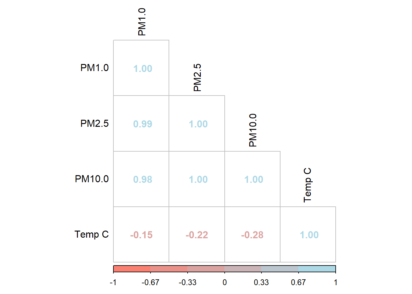
Looking at the air quality data, we notice a few things. Firstly, all the PM values have peaks in the same places, and they don’t seem too well-correlated with the outdoor temperature.
This isn’t all that surprising, and we can see the correlation is very close to 1 for the different PM sizes.
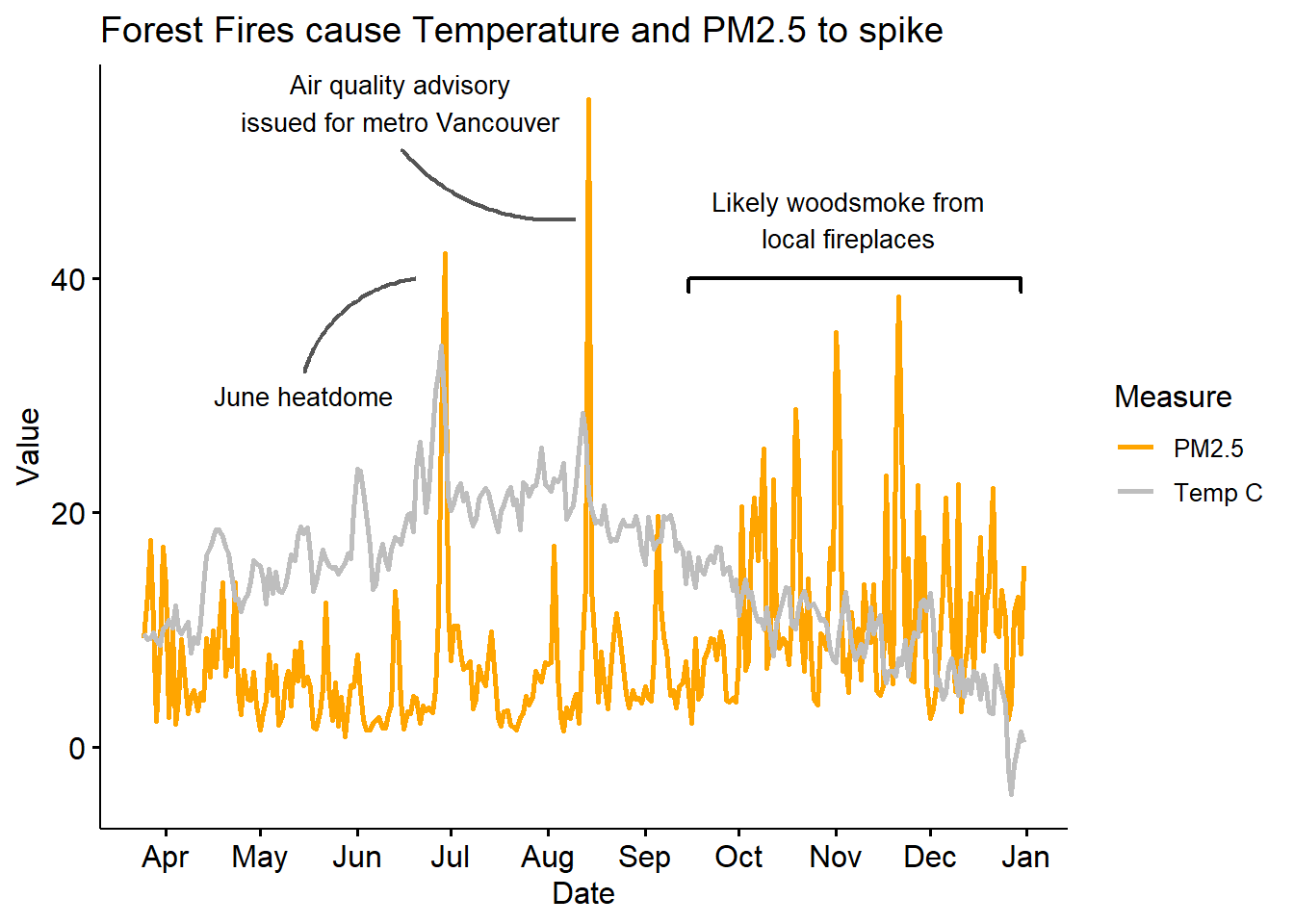
Picking just PM2.5, we can remake the first plot, this time showing the daily average, without the 10-day smoothing we used before. This gives us a more granular view of air quality events.
Code
air %>%pivot_longer(c(PM2.5, `Temp C`)) %>%group_by(name) %>%ggline(x ='Date', y ='value', color='name', plot_type='l', size=1, alpha =0.8) +labs(title ='Forest Fires cause Temperature and PM2.5 to spike',y='Value', color ='Measure') +scale_colour_manual(values =c('orange', 'grey')) +theme(legend.position ='right') +scale_x_date(date_labels ="%b", date_breaks ="1 month") +geom_label(aes(x =ymd('2021-05-15'), y =30, label ="June heatdome"), hjust =0.5, vjust =0.5, label.size =NA, size=3.5, family='xkcd') +geom_curve(aes(x =ymd('2021-05-15'), y =32, xend =ymd('2021-06-20'), yend =40), colour ="#555555", curvature =-0.3, size=0.8)+geom_label(aes(x =ymd('2021-06-15'), y =55, label ="Air quality advisory\nissued for metro Vancouver"), hjust =0.5, vjust =0.5, label.size =NA, size=3.5, family='xkcd')+geom_curve(aes(x =ymd('2021-06-15'), y =51, xend =ymd('2021-08-10'), yend =45), colour ="#555555", curvature =0.25, size=0.8)+geom_label(aes(x =ymd('2021-11-05'), y =45, label ="Likely woodsmoke from\nlocal fireplaces"), hjust =0.5, vjust =0.5, label.size =NA, size=3.5, family='xkcd')+geom_bracket(xmin =ymd('2021-09-15'), xmax =ymd('2021-12-30'), y.position =40, label='', size=0.8, tip.length =0.02)
We can clearly see the peak in temperature when BC got hit by the heatdome. We hypothesize that winter spikes in PM2.5 happen when nearby houses burn wood in their fireplace for heating, as they seem to be associated with relative dips in temperature.